Bubbling over into 2025
I’ve been experimenting with a fun type of painting . . . painting with bubbles. If you fancy having a go at this frothy art form that can either be used with traditional styles of applying paint or on their own for intriguing, abstract pictures, then here’s how I did it . . .
Angela Birchall
12/31/20245 min read
Over the last 50 years I have painted with oils, acrylics, watercolours, tinted charcoal paints, inks and Brusho using a myriad of different shape brushes, palette knives, cotton buds, sticks and plastic cards, but I’ve never painted with bubbles! Until now . . .
In this last week I’ve been playing around with painting in different media but always just creating the images by applying bubbles of paint. It’s great fun, but has its definite challenges especially in proportion of liquid (it makes wet-on-wet seem straightforward and predictable!) and how much colour/pigment/crystals you need to add to get a certain depth of colour.
When it came to framing and photographing them I also realised that there’s no obvious right way up, so I kept turning them round and round until I got a preferred top and bottom and then quickly signed them so I knew which way was up!
The whole process of painting bubbles with bubbles of paint was such a novelty that I just had to make it into a blog post so that if you fancy having a go as well, you will have a few hints and tips to get you going.
If you have used watercolour paint before you will understand what I mean about having to manage the proportion of pigment to moisture that you put on the page as to what effect and what strength of colour you are going to get. I soon found out that painting with bubbles is that issue magnified a hundredfold.
I wanted some vivid colours so my go-to choice was Brusho paint crystals. Anyone who has used, or even seen, Brusho will understand my decision.
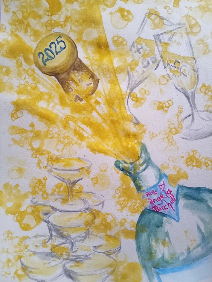
I had in mind a final picture that I was working up to which was my New Year 2025 painting of a champagne cork popping with champagne flutes and glasses and loads of frothy bubbles linking all these elements together.
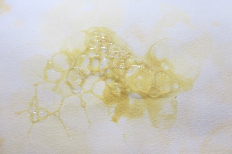
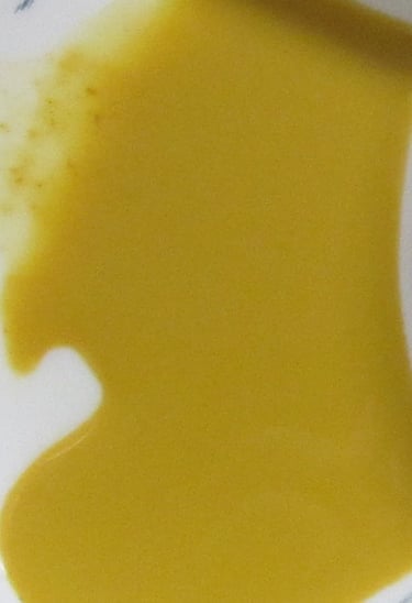
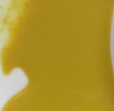
Thus, to create champagne bubbles I started off with some yellow paint crystals and, as you can see from the depth of colour in the palette, it looks more like a vibrant orange gold.
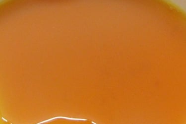
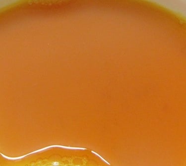
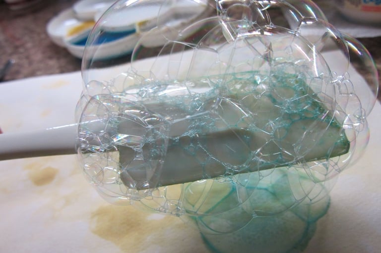
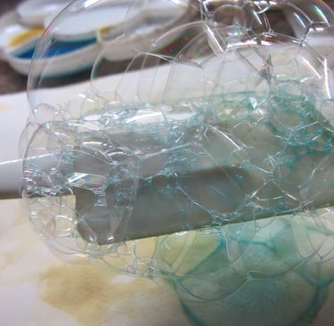
I thought it was going to be far too strong a colour but I’d got it mixed so I added some liquid soap and started blowing bubbles. I soon found that when you blow a mass of bubbles and scoop them out of the pot with a spatula you are met with pale yellow bubbles that look nothing like the paint in the pot.
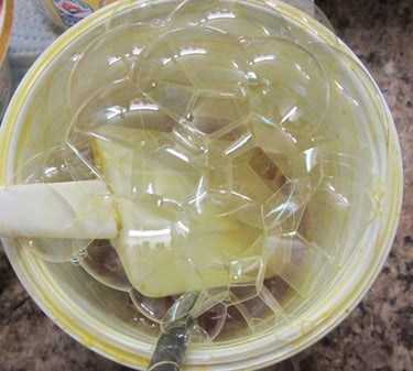
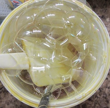
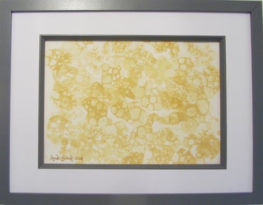
As disappointing as the colour was, I still had a long way to go to achieve the tiniest level of mastery of bubble paintings, so I carried on with pale yellow bubbles.
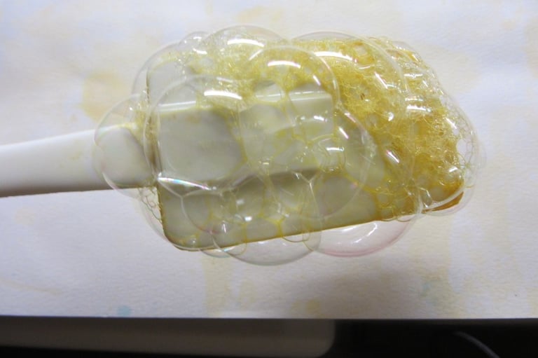
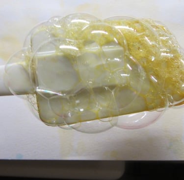
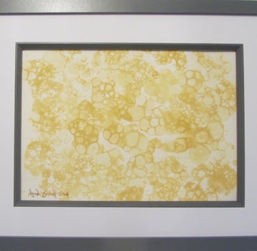
There is a point at which you let sufficient water run off the spatula but not so long that the bubbles burst . . . that point takes quite a bit of practice before you hit the sweet spot!
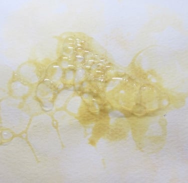
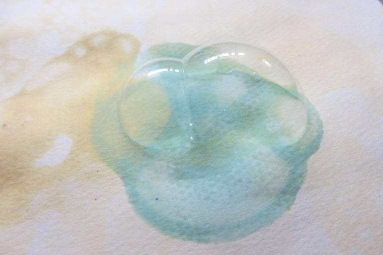
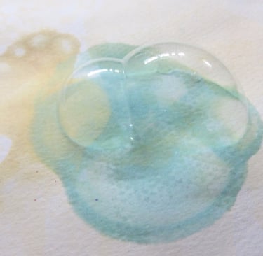
You can see just on this example where there’s too much water carried over onto the paper with the bubbles, especially on the right side.
As I always tell my students, there are no such things as mistakes, only experiments, and that you learn far more from those experiments that don’t quite turn out like you hoped they would. Oh boy was that true in this case!
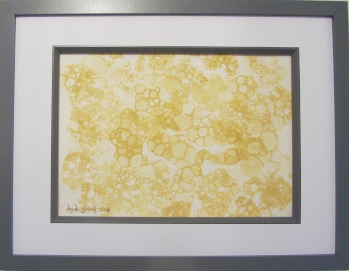
I did a few pages of yellow bubbles and I have kept them all because I can see my progress – something else that I am always telling my students to do!
Then I thought I’d ring the changes and go for a stronger colour. Still using Brusho crystals, I looked at the paint chart that I’d made when I first tried them out and, as you can see here, the turquoise was a really strong and vibrant colour.
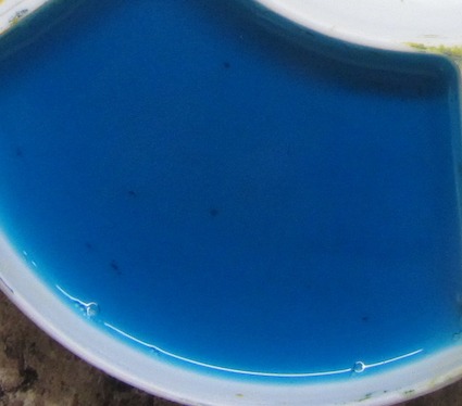
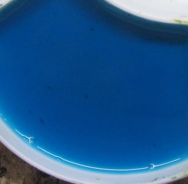
It also had too much water . . .
Well, at least I thought it was a strong colour, and it is in paint, it’s just not that strong in bubbles!
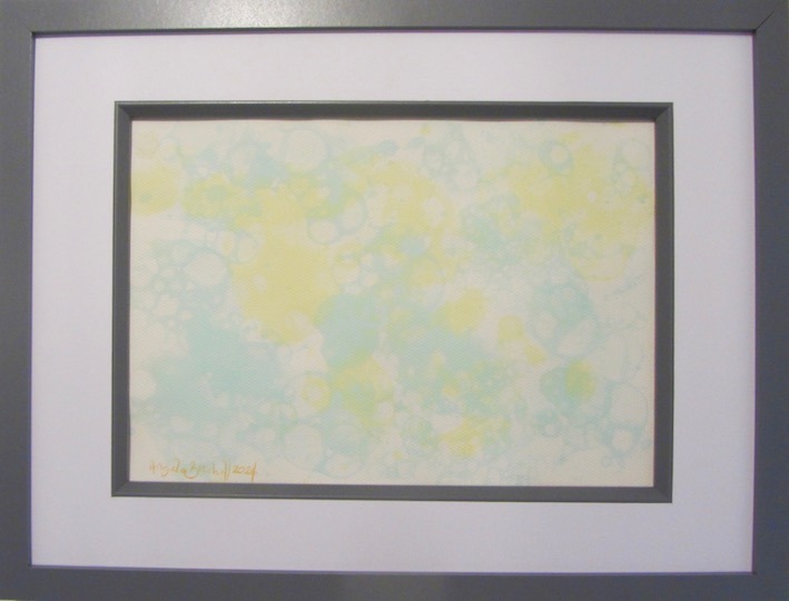
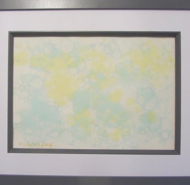
I increased the proportion of soap to the mix and that helped and I carried on with these two colours and achieved some reasonable attempts at creating a full page of bubbles such as this one . . .
Continuing my experiments I switched medium to watercolours. I usually use solid watercolour cakes, but in this case, I used tube paint. The first one was yellow ochre watercolour and it looked more like the colour that I wanted for the champagne bubbles.
Then I thought about how the paint crystals changed in hue and I expected it to pale to a level of colour you can barely see on the paper. Wrong! It was exactly the right colour.
I carried on playing with bubbles and was feeling more like I’d started to get the hang of it, so I thought I’d try another colour before I did the New Year painting that was in my head and itching to be put down on paper.
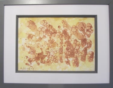
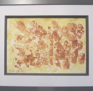
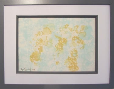
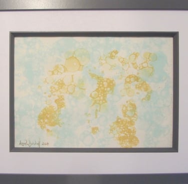
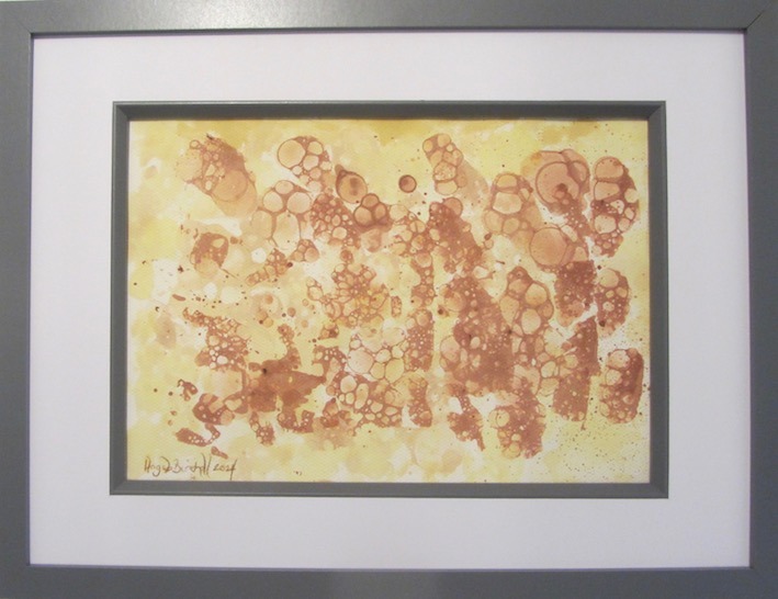
My last experiment was getting more of a bronze colour so I mixed equal quantities of burnt sienna and alizarin crimson, plus soap, plus a smidge of water and a good few lungfulls of air. The resulting colour was as I’d hoped, but it wasn’t the shade I wanted for the New Year painting, so I did a mix of the two watercolour shades to create this image of gold and bronze bubbles . . .
With my first set of bubble painting experiments concluded, I turned to doing my final painting of 2024 so that I can wish all my readers a very happy, creative and successful 2025.

Get in touch
Use the message box to drop me a line if you want to:
purchase my paintings or drawings;
discuss commissioning me to create a unique work of art especially for you;
have a question to be answered in a future Picture Perfect blog post;
join one of my face-to-face painting or drawing classes in West Lancashire or have private coaching online;
discuss a bespoke staff development event using art to encourage teamwork and leadership
Contacts
0044 77242 00779
youcandrawandpaint@gmail.com